A newly opened strength and conditioning gym for women in historic downtown Stillwater needed bold, apparel-ready branding. After a deep dive into the gyms roots and ownership, Lohly Creative took on the challenge and developed four distinct design directions, each crafted to stand out on apparel, water bottles, and other weightlifting gear.
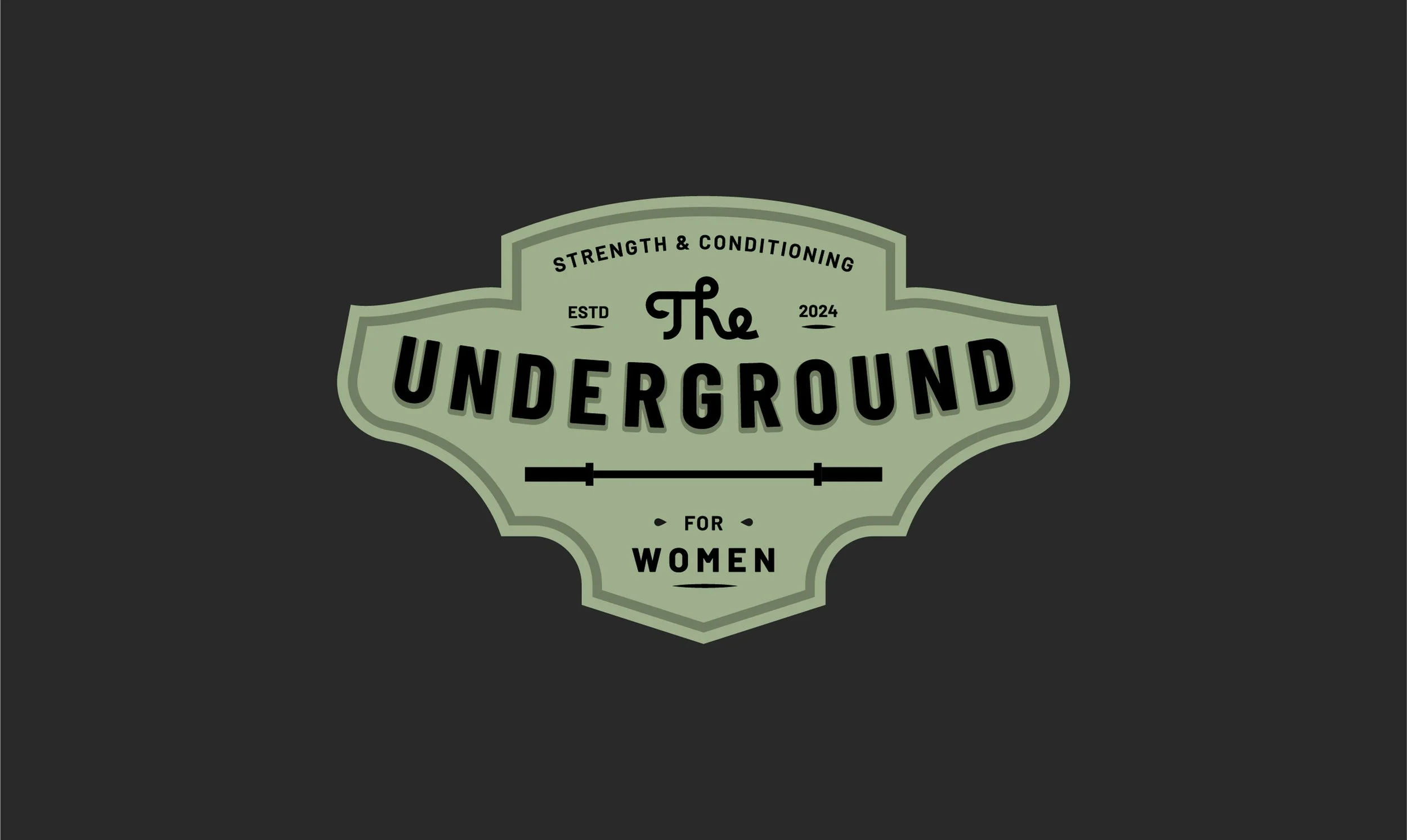
Modern Nostalgia
This badge says it all—modern lines wrapped in a nostalgic, throwback style. “The” is a custom, hand-drawn form that introduces the mark with personality, setting the tone for the modern sans-serif typeface that curves downward to emphasize “Underground.” Supporting elements—“Strength & Conditioning” and “For Women”—appear as secondary details, alongside the weight bar, an essential nod to the training at the core of every Underground class.


Above & Below
This badge stamps its approval wherever it lands. Its oval shape offers versatility across nearly any setting, anchored by a bold, modern, reversed-out typeface that dives deep—underground. Above ground, the supporting design elements tell the rest of the story, featuring a weight bar divider and a hand-lettered, retro “For” that adds a vintage twist.


Simple & Elegant
A stripped-down take on Concept 1, this mark delivers everything you need—nothing more, nothing less. “The” leads the design, twisting itself into the Underground’s signature weight bar, which rests atop a clean, modern typeface set with confidence.


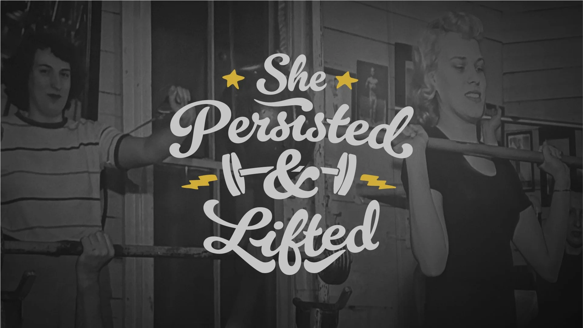
Fun & Fierce
She didn’t just persist—she threw some heavy weights around while doing it. This design puts the “lifted” in “persisted” and looks darn good doing it. Strong, fierce, and just the right amount of fun.